This is my powerpoint addressing the driving routes and optimal sales routes for Napaa's Best Company. I had lot of issues along the way. Mostly with understanding what wass expected from us. Then with optimizing the routes, I was not able to optimize using a time reference, so my routes are a little long looking. Finally, I could not copy and paste the driving direction without hte document being like 50 pages, so I imported them as a object within my powerpoint. I hope they can be opened outsside the server.
Powerpoint
Wednesday, November 24, 2010
Wednesday, November 10, 2010
Project 4: Prepare

This is my map showing the spatial distribution of Napa County, CA. We have been asked to show the locations of both liquor stores and restaurants. Also provided are the distribution of households, alcohol sales, Restaurant Sales, and Household Wine Consumption. The last is estimated by 18% of liquor store purchases plus 6% of restaurant sales as instructed.
Question 1: What do you observe about the geographic distribution of households and their restaurant, liquor store, and wine purchases in Napa County?
Answer: One can see a very similar spatial distribution of the key factors. There is more restaurant and liquor sales in the most populated areas, especially in the Central Eastern portion of the county.
Question 2: What do you observe about the distribution of liquor stores and restaurants to these purchasing patterns?
Answer: Many of the restaurants are located along major highways just outside the highest populated region while remaining in regions of still what is considered high population density. While the liquor stores are more spread out with many being located within the highest population density area in the East Central Region of Napa County.
Monday, November 1, 2010
Better Books Stores New Site Location Report
This is my new site analysis for Better Books in San Francisico, Ca. The report shows the pros and cons of each of the considered locations as well as analysis of existing locations characteristics in order to determine a model store to use while establishing the new site.
Summary
Summary
Monday, October 25, 2010
Project 3: Better Books Stores Analysis

This is my second map map for analysis. It shows the competitor stores and the 3 key properties which are being considered for a third Better Book Store.
 This is the first map for analysis. It shows the two market areas shapes. The first is based on driving distance the second is based on percentage of book club members.
Monday, October 18, 2010
Project 3: Prepare
 This is the second required map. It shows the 1 mile buffers of the 2 Better Book Stores in San Fransisco. I also added the required calculations from an excel spreadsheet to the map. These were based on the % of people having some college.
 This is my first map of the 4 demographics in question. It shows the location of the 2 Better Books Stores and the location and annual income of competitors stores in the area. I have compared these locations with the Total Net Worth, Average Household Income, % of population with some college education, and Total numbers of households wihtin the areas.
Monday, October 11, 2010
Monday, October 4, 2010
 This is a map showing Carbon Storage Capacity in Tons for each of the neighborhoods. It also shows Carbon Sequestration Rates in Tons/Yr for each of the 5 neighborhoods. I used multiple ttechniques to produce this map. I used the append tool to combine the 5 neighborhoods. Then I added fields to the atrributes table for carbon capacity and carbon sequestration. I had to add the values to the atrrributes table using the Editor tool for that layer and saved my edits. I was then able to symbolize to show the neighborhoods in red and orange with low numbers in both storage capacity and sequestration rates. This is a good indicator of which neighborhoods we will have to concentrate on for planting of new trees.
This is a map of tree coverage percent for the 5 major neighborhoods of Marin City, California. I have reclassified the coverage for the entie city. Then used the Extract by Mask tool to isolate each of the 5 neighborhoods land cover types. Through calculation using the field calculator, percentages of total acreage were calculated for each neighborhood. I also added a graph to show the percentages from excel.

Tuesday, September 21, 2010
Project 1: Report 3
 This is an updated map with the hospital names highlighted. I know its too late. But I wanted to post it. Thank You to all who helped me with doing this the way I wanted to.
 Now that we have homed in on Alameda County, further analysis is required. We must look at the percentage of black households for Alameda County. I have focus on the North West Corner of Alameda County due to the high percents of black household. With the analysis of contamination sites of Alameda County, most of them were in the North West region. This was also a reason for my concentration on the area. I have buffered the pollutant sites to 150 meters for dispersion. I have alsao buffered the major roads of the area to the same distance of 150 meters. As we home in, we can see that there are four hospitals in this zone of High Black Concentration, high pollutant site concentration which will produce the ozone and particulate matter that we have shown to be correlated with high asthma hospitalization rates. I decided that the analysis of Eauclidean distance from the hospitals made the map a little confusing so I decided not to use it. In conclusion, I have shown that there are four hospitals which to allocate monies for dealing with high asthma hospitalization rates first. They include Children's Hospital, Highlands General Hospital, Alameda Hospital, and Booth Memorial Hospital. I tried to label these four hospitals but ran out of time. I was planning on using Adobe Illustrator to do this, that is the only reason they are not labeled. I tried to do this in Arcmap and could not find any style that stood out enough for me to consider using it.
I would like to add that if I had the time I would have presented this to the Board at the next meeting as a powerpoint of all my maps not just one. I beleive that all the data was relevant in order to narrow down the search for the four most critical needs hospitals of the San Francisco Bay Area.
Project 1: Report Part 2
 The second part of report points to narrow the search for hospitals with critical needs for money allocation for high asthma hospitalization rates. This map shows that Alameda County has the highest rates in the San Francisco Bay Area of somwhere between 12.85% and 17.8%. This suggest that we might have to take a closer look a Alameda County.
 The second map in this set shows a comparison of the two types of households which have been shown to be at risk. Both Black and Hispanic Households are compared with Asthma Hospitalization rates. There is correlelation in both groups. However, you can see the much higher percentages of black households in correlation with the high hospitalization rates of Alameda County. This helps us to focus in on black populations of Alameda County.
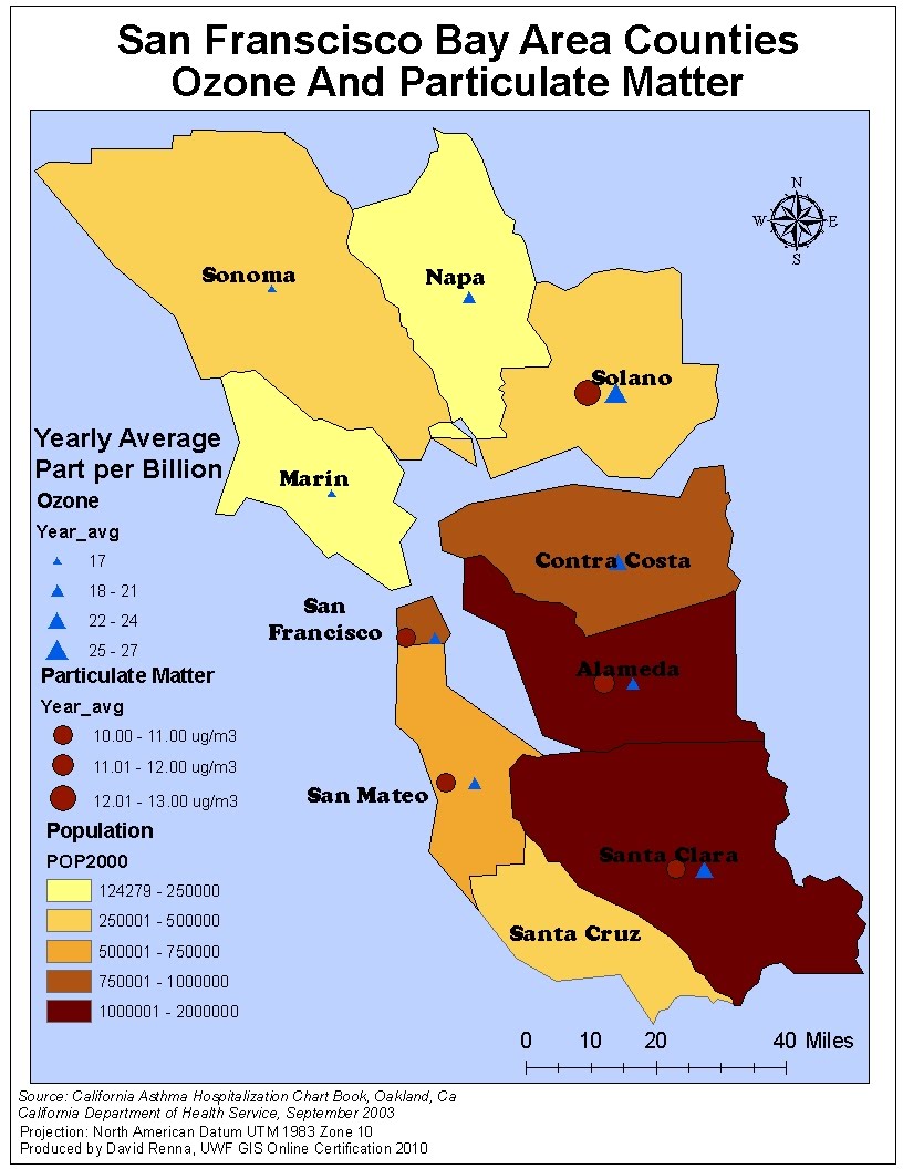 Now we must look at Ozone levels and Particulate Matter levels of the San Francisco Bay Area Counties. You can see the relative high ozone levels in both Santa Clara and Alameda Counties.
The yearly average in both counties is about 22-24 part per billion which is considered high in our research. Secondly, you can see the high particualte matter levels in the four counties of San Francisco, San Mateo, Santa Clara, and Alameda. So We now know that the Southern portion of the study area have high concentrations of 11-12 ug/m3 of particulate matter. At the same time, we can see the high ozone levels of the South West region of the study area.
 Finally, we transpose the ozone and particulate matter data on the map of Asthma Hospitalizaiton rates. This finalizes the need for a closer look at Alameda County.
Project 1: Report Part 1
 This is my Population Density Map for the San Francisco Bay Area Counties. I would like to point out the high population densities of the South West counties of Santa Clara, Alameda, and Contra Costa Counties. This high density will provide a good assessment for the allocation of fund to local hospitals with high asthma hospitalization rates.
 County officials have asked for a comparison between uninsured percentage rates and unemployment rates for each of the counties in the San Francisco County Area. They have also require comparison of single mother households with uninsured percentage rates. The scatterplots provided show that there is only a slight correlation between uninsured rates and unemployed rates. There is even less correlation between uninsured rates and single mother households. I believe this is due to the fact that the most important thing for a single mother is to have health insurance for her family.
 Finally, the officials wanted to see if the was correlation with uninsured rates and both hispanic and black householod rates. As you can see, the scatterplots do not show much. However, you can start to see visually that Alameda County has both high percentages of both Asthma Hospitalization rates and hispanic and black percentage households. I think my scatterplots are incorrect. I could not get them to show any correlation at all. I redid these many time without success. However, I do see the corelation visually in the maps.
Wednesday, September 15, 2010
Project 1: Analyze Asthma Data San Francisco

This is the base map for hospitalization rates due to asthma for the 10 counties in the San Francisco Bay Area. The data was produced from Asthma Hospitalization Data Chart Book from September 2003. The number of incidents are reported per 10,000 people. I used the GNIS layer to collect hospital data instead of the suggested county layer. This allowed for me to show 198 hospitals in the area as opposed to the 19 in the county layer.
Tuesday, September 7, 2010
Metadata Documentation Project 1
Here is the required metadata for the 6 files I believe will be used for Project 1. I really got lost in this. I found myself checking and rechecking things I had already done. I guess this will take a bit more practice before I feel confortable with it. I probably missed a couple things. I also found that I could not document the attributes to my excel spreadsheets because there was no way to add a title to the attributes. Maybe I will find a way to do this later.
Air Monitoring Stations Metadata
County Shapefile Metadata
Demographics Spreadsheet Metadata
Asthma Spreadsheet Metadata
Ozone Spreadsheet Metadata
Particulate Matter Spreadsheat Metadata
Air Monitoring Stations Metadata
County Shapefile Metadata
Demographics Spreadsheet Metadata
Asthma Spreadsheet Metadata
Ozone Spreadsheet Metadata
Particulate Matter Spreadsheat Metadata
Wednesday, July 28, 2010
Module 5: Conversion of LIDAR to Raster Image

This is Module 5 LIDAR Challenge Assignment. We were required to take raw LIDAR data and transform it into a raster image in ArcMap. I first imported the data into Excel and added the appropriate headings. This made the data easily importable into ArcMap. Then using the Inverse Distance Weighted (IDW) tool in the spatial analysis tool set,
I was able to produce a rastere image of the data points. I set the symbolism to stretched and chose an appropriate color ramp to highlight features. Then in ArcCatalog, I created 3 new shapefiles(Water,Dunes, and Road). I added ighlighted the the new shapefiles to my map and edited the specific features. I then added a grid as instructed spreading the grid interval a bit. I then added all other required features like north arrow and legends, scale bar and text. I also added a small description of what the image was and how it was produced. Finally, I highlighted the features in the image that were identified such as the road,waters, and sand dunes. I only had problems with projection. Like most, I got a scale of over 4400 miles at first. I went back and redid the image with the correct WGS 1984 UTM Zone 16n projection in Universal Tranverse Mercator and did not have any other issues.
Tuesday, July 20, 2010
Module 4: Supervised Classification Challenge
This week we were required to take an image of Germantown, Maryland and do a Supervised Classification in ERDAS Imagine of the image to known land cover types. We were required to use 14 categories and label each type. Then using histogram values, we were to categorize the land in the image.
I really did not have too many problems with the assignment. I was able, through trial and error and the known value ranges, to match all but two categories. The grass areas and Ag 4 areas had a bit high histogram values. I found that if I adjusted these values many other categories fell out of range so I felt that this was as close as I could get. I did spend many hours adjusting the Euclidean Distance values to get the histogram values within range.
Week4:Supervised Classification
Wednesday, July 14, 2010
Module 3- Orthorectification Challenge
This is my submission for the Module 3 Challenge Assignment for GIS 4035 Remote Sensing and Photointerpretation at the UWF Online GIS. We were required to take an image of downtown Pensacola and orthorectify the image to an existing map using GCP or Ground Control Points. The requirement of a RMS error of under 1. Using 7 control points, I was able to get low RMSE numbers with an Avg. error of .2545.
Challenge3 Map
GCP Table
The problems I had with the assignment were in the practice section. I could not get my RMSE below a couple thousand on some of the fiducials. I did not have this problem with the challenge. The only problem I had in the challenge waas that I had to move my UTM grid slightly to the left in order to see the numbers better on my map. I think this might cause a slight error in my Longitude on the grid.
Tuesday, July 6, 2010
Week 2: Spectral Bands Basics Challenge
Below are the 3 maps required for GIS 4035L/Remote Sensing and Photointerpretation for Summer term at UWF online. The first map shows a water feature which we were required to identify using the different spectral bands and their associated pixel values. The spike in the histogram for layer_4 between pixel values 12-18 are associated with the many water features in the image.
The second map we were required to determine from the histogram of Layer_5 and Layer_6, what sort of feature would likely cause a spike around pixel values 9-11. At first glance, I thought it was snow but after a little research I determined it was a glacier feature. The image we are looking at is within the state of Washington and around the Mt. Rainier area. This area is well known for its glaciers.
Finally, the third map we are required to identify a feature in the image of shallow water. I changed the image to better show the feature by using LandSat 5 TM Bathymetry Red: 3, Green: 2, Blue: 1. This enable me to easily identify the shallow water feature in the SW region toward the Pacific Ocean as an area where the feature was present.
Monday, June 28, 2010
Remote Sensing: Challenge 1: ERDAS Map Composition
http://students.uwf.edu/dwr6/Challenge1.xps
This is Challenge 1 for Remote Sensing and Photointerpretation class at UWF GIS online certification. I have produced this map in ERDAS. It is a image of the Pensicola area in NW Florida. I have highlighted the Naval Air Station in the SE region of the image and circle and labeled it. I also included the basic map design requirements of a neatline, a North arrow, and Scale Bar. I tried for very long to add a legend but with no success. I kept getting an error message " no Psuedo-color in selected region" Huhh?? I guess since we have to add the elements to the ovr. file extension and not the image itself that is why this might be occurring.
I had many problems with ERDAS this week. As with all new software, you must dredge through the learning process. I have lots of trouble with Adobe Illustrator in the beginning as well. However, after much practice I began to see the advantages of Adobe. I hope the ERDAS is the same.
Subscribe to:
Comments (Atom)